The Brief
Understanding the problems, goals & scope definition
Problem:
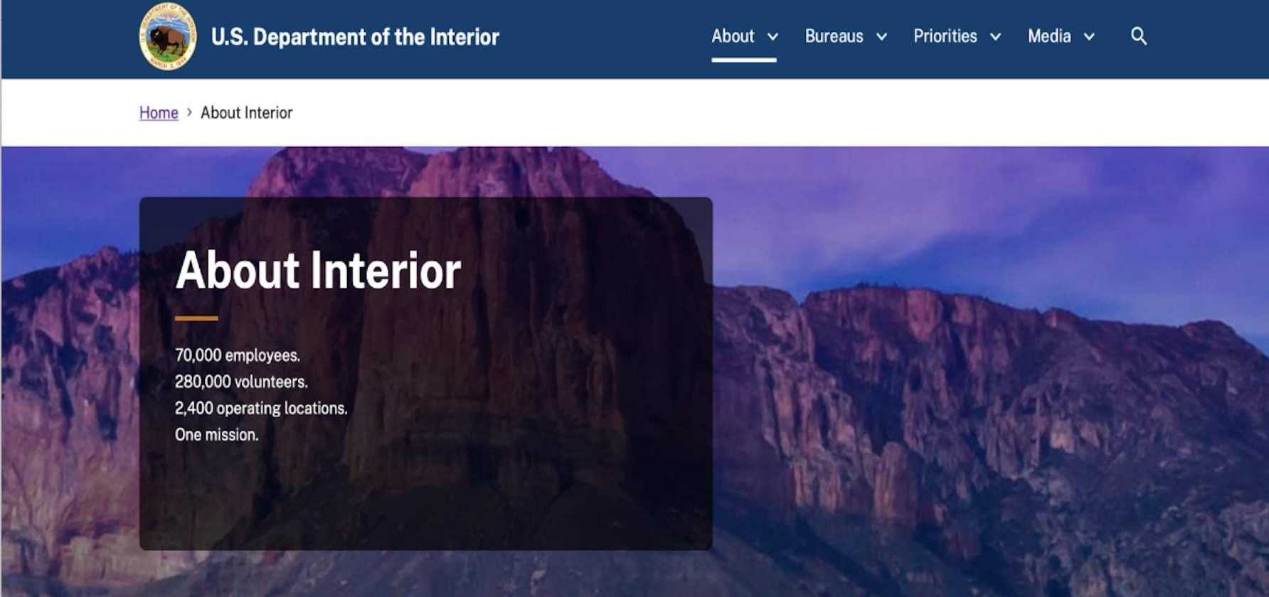
The current Department of the Interior website is cluttered and lacks an intuitive user flow, hindering efficient navigation and user engagement.
Goal:
Our goal is to make a website that is transparent, intuitive and accessible. This will make the website more inviting, in turn driving more traffic to the site.
Impact:
Through a website reorganization aimed at enhancing user flow and interaction, visitors will enjoy streamlined access to critical information, thereby fostering greater engagement and understanding of the DOI's conservation efforts and natural resource management goals.
Building Context
Building the background context to inform design decisions
Heuristic Evaluation
I found that the main navigation seemed “random” and lacked user clarity.
There was random information sprinkled in, that did not seem to have a connection with the website
The photos and text were granulated and pixilated
I filled out a heuristics evaluation template- where I looked at the colors, content hierarchy and design of the current website.
As highlighted above, I identified areas for improvement within the DOI website, focusing on spacing, content hierarchy, and imagery enhancements.
Proto Persona
I created a proto persona to map out the user's journey on the DOI website and to gain insight into their motivations for visiting.
Ideation
Generating innovative ideas to inform design decisions.
To redesign the website, I began with a card sorting exercise to figure out the best way to organized the sites content. This helped me determine the most intuitive structure for users. Based on these insights, I created a sitemap recommendation, outlining the main pages and subpages give users a friendly and logical navigation experience.
I began mapping out the primary and secondary pages of the current website.
I did card sorting to determine the best layout for the website.
I developed a sitemap recommendation outlining the key pages and subpages to be included in the website redesign.
UI/Layout
Crafting the UX/UI layout to enhance the user experience.
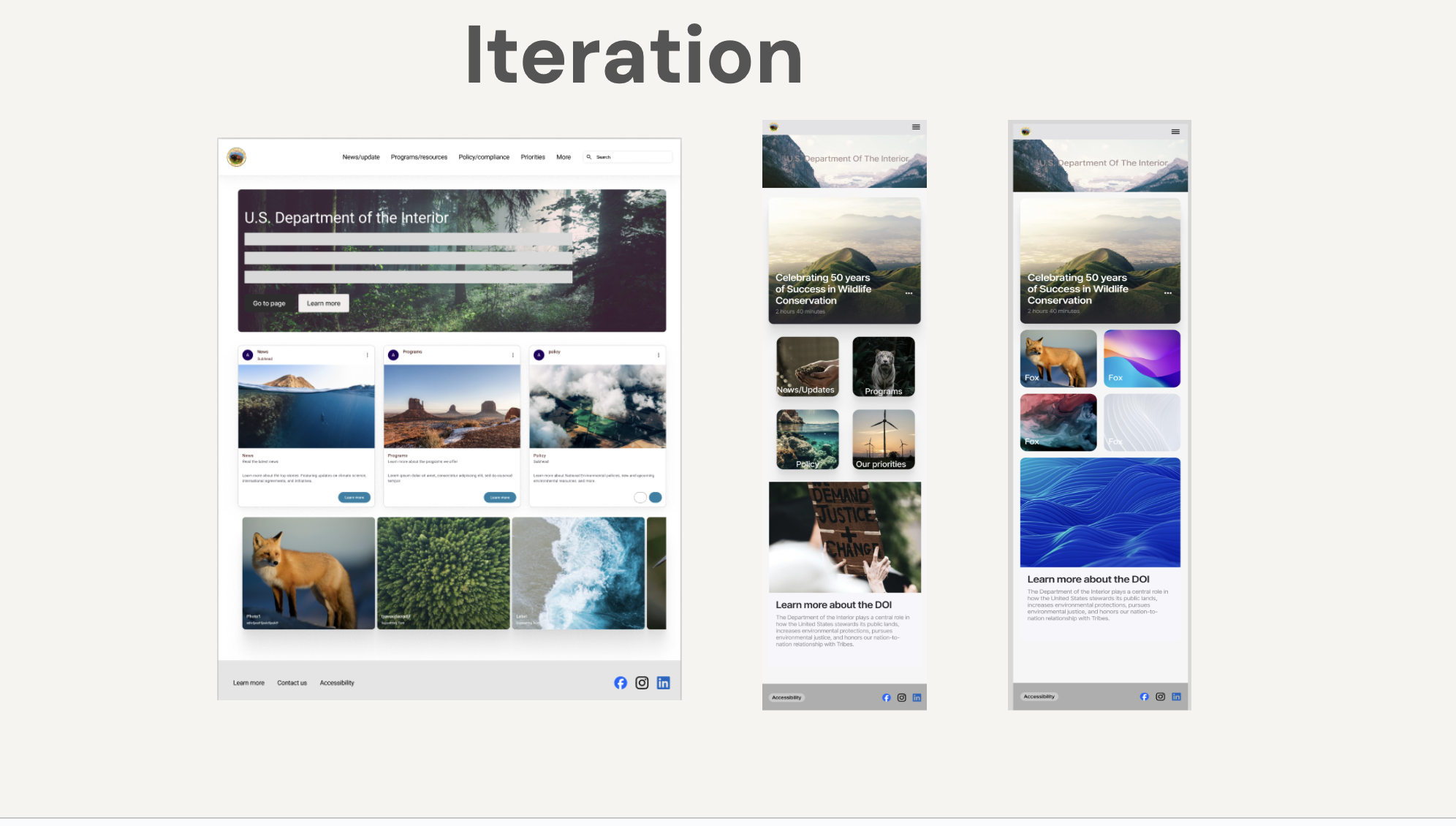
I created a low-fidelity prototype to outline the basic structure and functionality of the website. After conducting user tests and gathering feedback, I iterated on the design, refining it into mid and high-fidelity prototypes .
I started to really flush out the project by designing components and mapping out low-fidelity navigation. Sown above is the desktop version of the low fidelity wireframes.
After completing the desktop version, I focused on mobile responsive web design (RWD). I created components and dropdown menus, then mapped out the placement of content and images, using placeholders to visualize the layout.
I created a style guide inspired by a fresh, nature-driven aesthetic to give the website an intellectual yet inviting feel.
Midfi Prototyping
I began incorporating photos and colors, advancing my prototype to a mid-fidelity stage.
I conducted user testing and gathered valuable feedback, which I used to iterate and improve the design.


